Big Picture
The big picture introduces the page. It fills the width of the display. The big picture is before the container which centers everything else.
Starting a browser page with a full width picture and following with centered text is now common. It takes advantage of the wonderful HD displays while still preserving narrower lines for easier reading.
The rest of this page is like the bottom of the Pictures page.
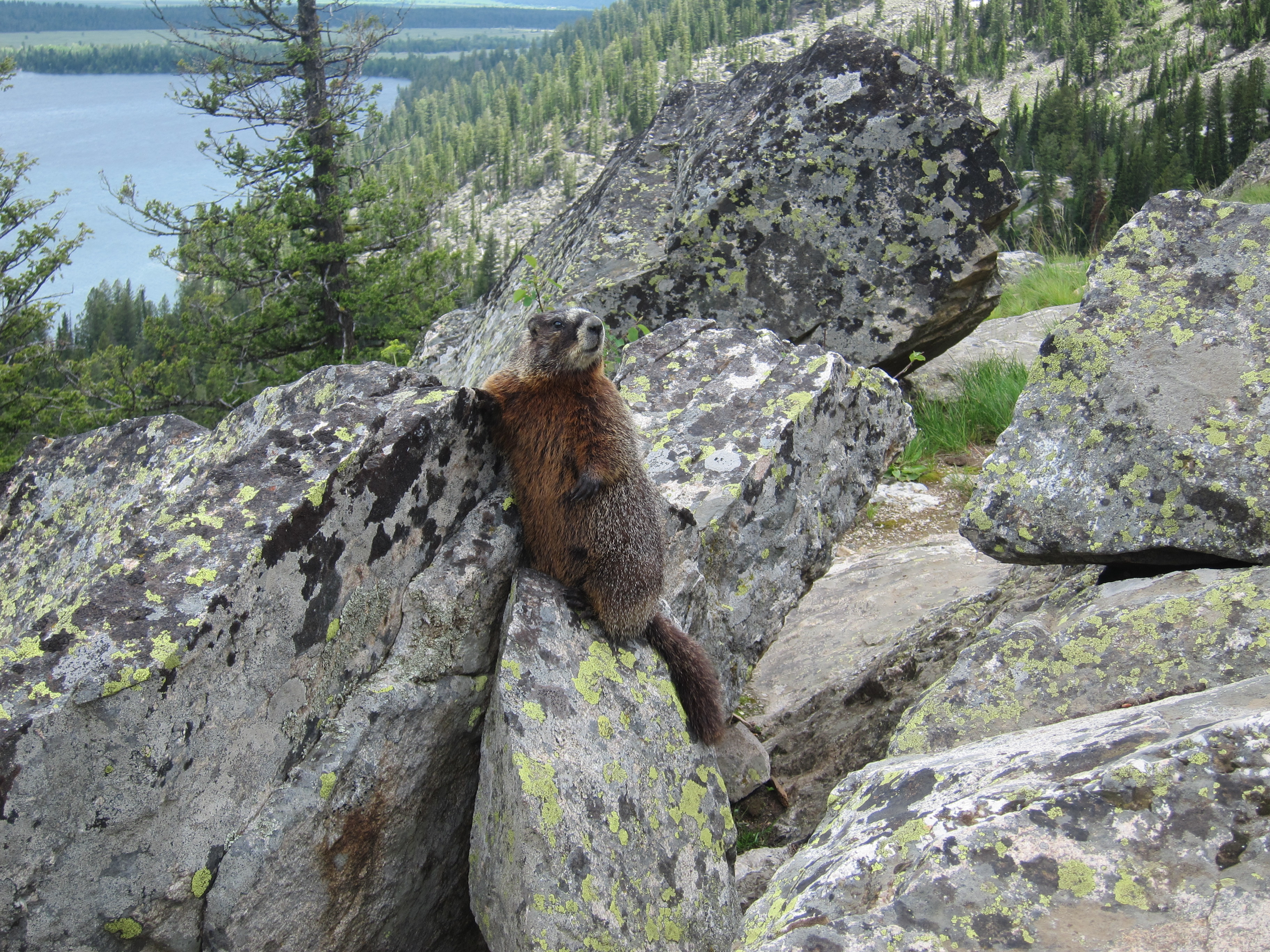
The Yellow-Bellied Marmot picture fits on a 768 pixel high display with this line.
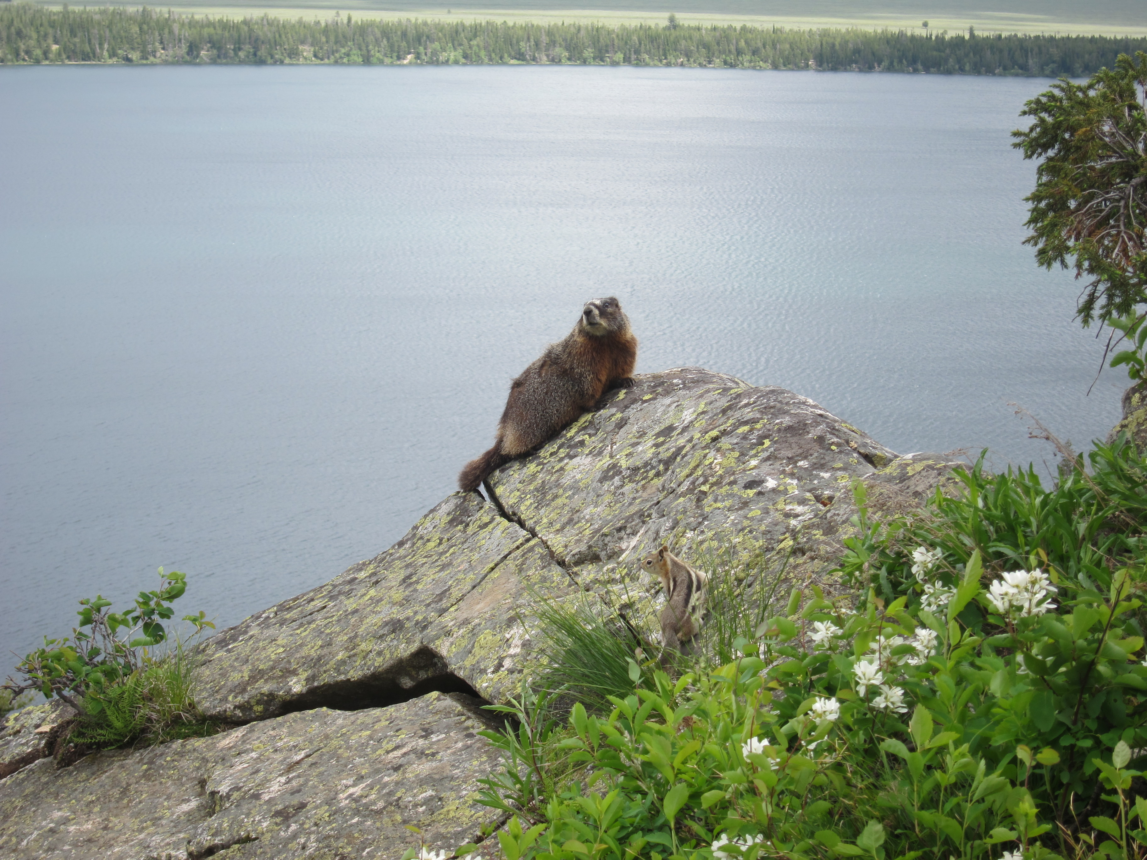
The picture of both animals fits on a 768 pixel high display but typically this line does not fit with the picture.
Display pictures as a percent of the working area's width.
Specify pictures as a percent width of the container's width. This has the advantage of resizing the image so that it always fits horizontally in the display on displays less than 1024 pixels wide.
Initially display images at or near the actual display resolution.
Create and initially display a reduced resolution image if the original is significantly higher resolution than the display resolution. The reduced resolution image typically has a smaller file size for faster initial load.
This reduced resolution image has the advantage of being directly supported by Insert Image in Amaya. Images with 3000 or more pixel width do not display successfully in Amaya with container width significantly smaller. As an example directly inserting the full resolution image Yellow-bellied_marmot_and_Golden-mantled_ground_squirrel.JPG (3648 wide by 2736 high). It does not work in Amaya but it does work in modern browsers.
Make the image a link to the full resolution image.
Make the displayed image a link to the full resolution image. Typically browsers open a new page just showing this image. Clicking on this image again provides the full resolution image which requires scrolling around to see all of it.
Page width
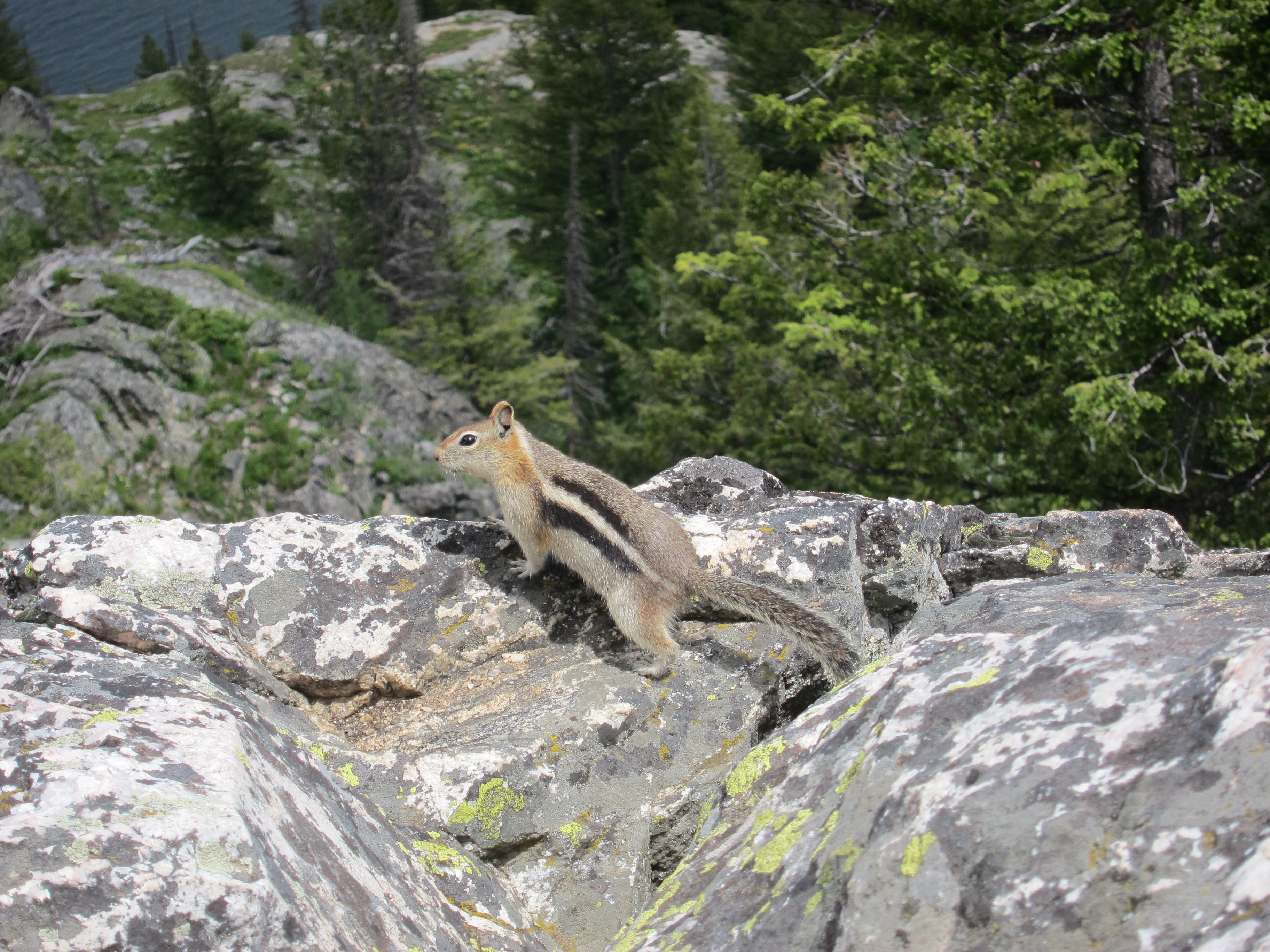
The page width used by the .css files is 960 pixels between the vertical lines. There is an additional padding of 20 pixels on each side of the text and pictures. This leaves 920 pixels as the 100% width for a picture. A 50% width picture is 460 pixels wide. The squirrel picture at the top of the page is displayed at 56% width which is 515 pixels in the 920 pixel working width.